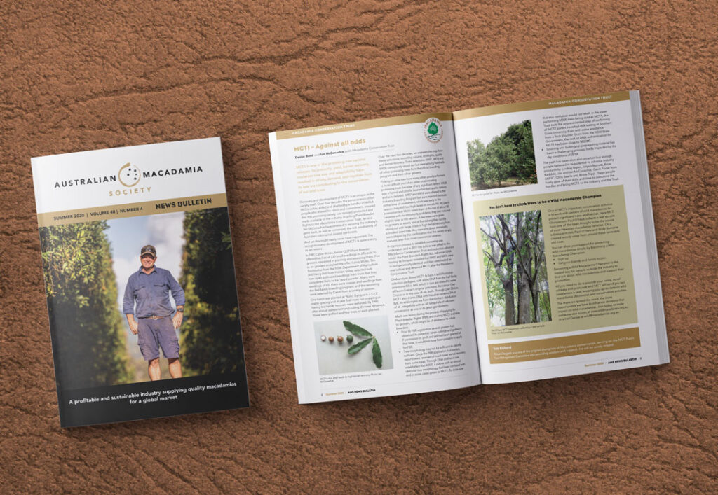
I have been producing a Bulletin for The Australian Macadamia Society for many years. This is a quarterly production involving a collaborative effort between myself, the AMS editor and Project Coordinator to meet a strict deadline. This magazine is an invaluable resource for Australian Macadamia growers across Australia.
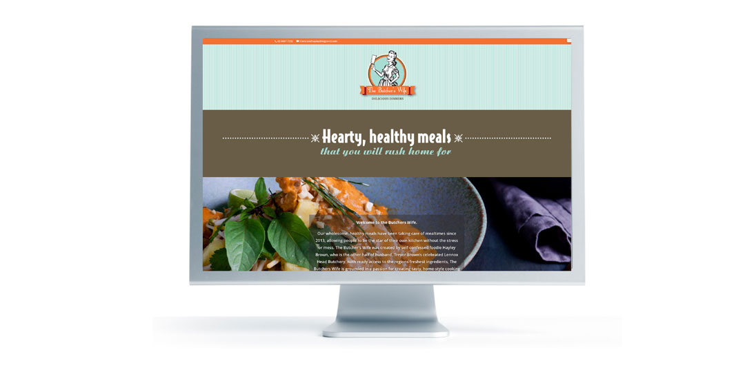
The Butcher’s Wife was created by self-confessed foodie Hayley Brown, who is the other half of husband, Trevor Brown’s celebrated Lennox Head Butchery. With ready access to the regions freshest ingredients, The Butchers Wife is grounded in a passion for creating tasty, home-style cooking that everyone enjoys, while helping busy people dish up nutritious dinners on the run. This one page website was produced for Hayley with a brief to be brief. With beautiful photography of her produce, it was easy to achieve. You can visit her website here.
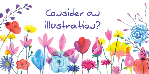
Trying to find a new way to present your concepts or ideas in order to capture the attention of our over stimulated society? Why not consider going for an illustration. Illustration is used because it is creatively never ending and it doesn’t have to relate to reality. It can break the rules and it can become synonymous to your business. Read more . . .
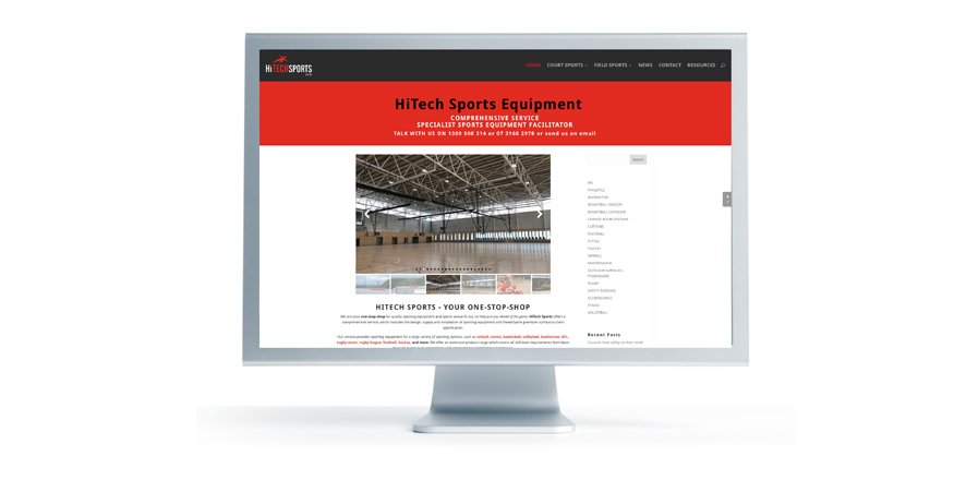
We have been working alongside HiTech Sports, updating their website to a more simpler, user friendly version using images supplied to showcase the work they do and the products they supply. You can visit the website here.
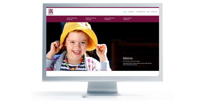
Adeona, a pioneer in early childhood education required a new look website that would be easy to update and extend on as they grow and move forward. Starting with just one centre in Coorparoo, they now have three other centres based in Queensland, with three of the centres rated Exceeding National Quality Standard. Wanting to make the website an image based site, a professional photographer was engaged and some beautiful images were produced of the children and the centres which made working on this website pure joy.
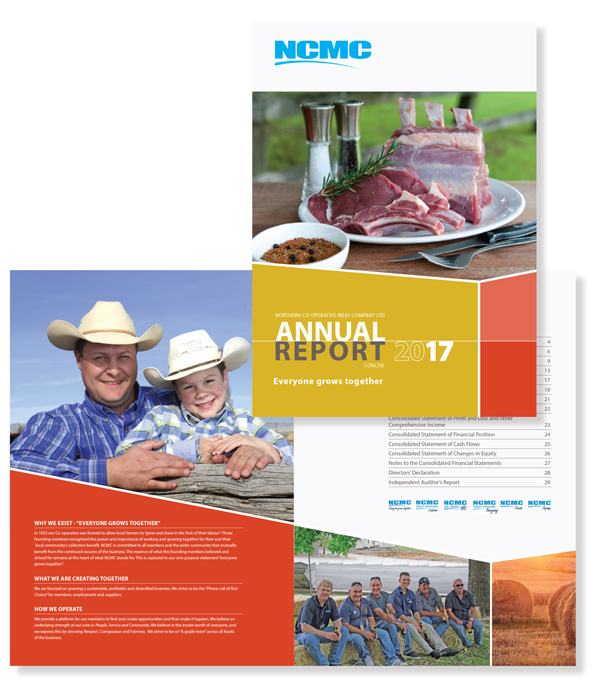
We love annual reports at molto creative. It is rewarding to create a professional report from the text and images supplied. Changing charts and graphs into colourful and easy to understand infographics is a rewarding challenge. Having wonderful photos to work with can enhance and tell your story. A professionally designed and written annual report can provide a great opportunity to communicate with your market, share your vision and reinforce your brand. This report was recently completed for Northern Co-operative Meat Company Limited and was a pleasure to work on once again.
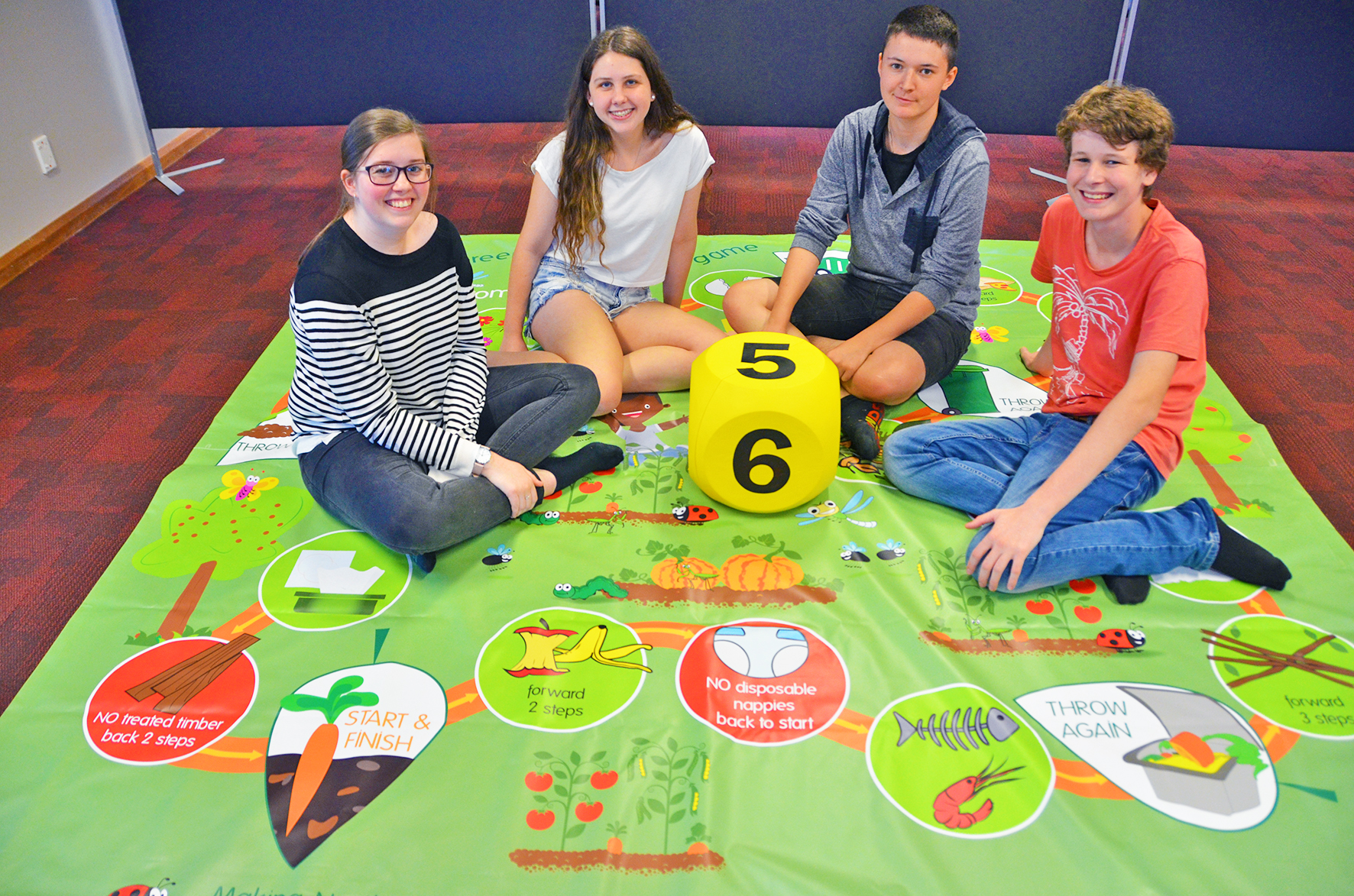
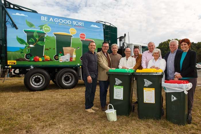
My high school tafe students have created an over-sized board game to help Lismore City Council teach kids about the organics composting system at public events. The aim of the game is to reinforce what can and cannot go into the organics bin. The game will be used at local markets, shows, expos, shopping centres and community days.
The students jumped at the chance to take on the design challenge and were focused and receptive throughout the eight-week project. It was a real life scenario project and it was exciting to see the finished product and how it is going to be used in the community.
They each had to design the graphics and also make changes when something wasn’t working. Well done!!
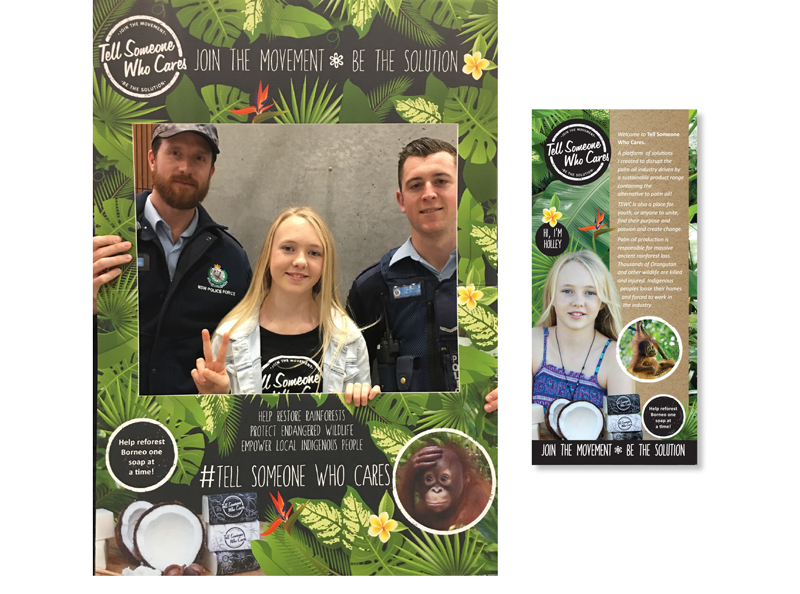
Holley, a young local Lennox Head girl was invited to speak at the world’s largest conference on happiness and wellbeing Happiness and Its Causes in Sydney on the 22-23rd June. Holley was the youngest speaker ever to be included and so she wanted to use this opportunity to help promote her efforts in creating disruption to the palm oil industry. I was happy to help, as I have travelled to Borneo and have seen first hand, the massive destruction the industry is causing to the ancient rainforests, wildlife and people. Holley required some urgent artwork for a selfie frame and DL brochures for the event which were produced over a weekend. You can find out more and help by visiting Holley’s site.
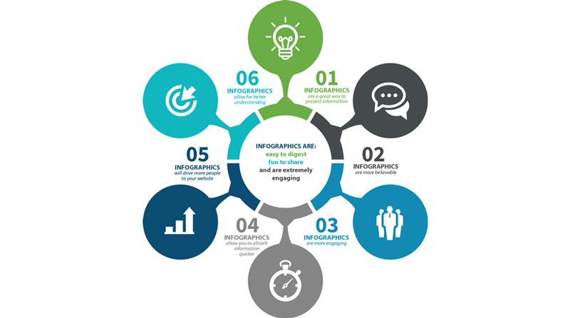
An infographic is a way to present information, data, and knowledge in a visual manner. They do a great job at building brand awareness and getting a specific message across. Read more . . .
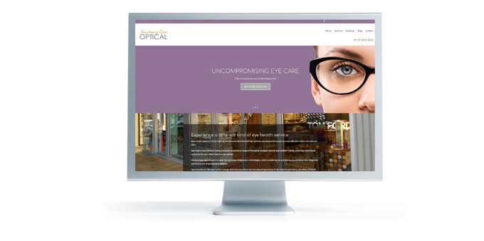
A boutique optical practice using the very latest diagnostic technologies, and also stock an exclusive range of European designer optical and outdoor frames. Check out their new site created by molto creative.
Rous County Council is a merger of Rous Water, Richmond River County Council and Far North Coast Weeds and sought the services of Molto Creative to develop a new logo and supporting branding elements.
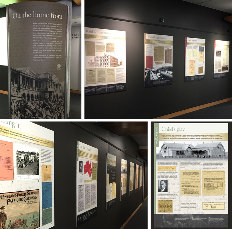
This exhibition ‘On the home front’ was officially opened today and highlights some of the records in Queensland State Archives’ collection which document life on the home front in Queensland during the First World War such as the treatment of ‘enemy aliens’ – principally Germans and the issue of military conscription. Did you know that each time a referendum was held, the majority of the Australian public voted against military conscription. Conscription divided the nation along both political and religious lines.
Twelve boards were created, printed and mounted onto PVC along with one large introduction panel.
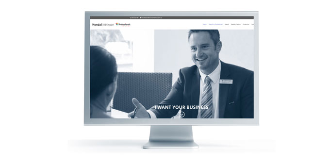
This website was designed for Kendall Atkinson – a real estate agent for The Professionals Ballina | Lennox Head. It was created using the WordPress platform which enables him to edit content and upload recent sales and information for visitors interested in real estate within the local area. A profile video was also added which was uploaded to YouTube and linked to the site. You can view the site here.
CMYK and Pantone are two different colour systems to describe the printing process of your finalised artwork. CMYK or ‘four colour process’ printing has become the norm of late as consumables, idle machinery and the dominance of internet mediums force costs down. To simplify CMYK printing, think of the cartridges that go in your office or home laser printer – there’s likely a yellow one, a red, a blue and a black that combine to provide a full colour range. In the crudest sense, that’s CMYK – Cyan, Magenta, Yellow and Black.
A Pantone colour, on the other hand, is a specific colour that has its own ink well. It’s an industry-standard colour system and when printed professionally should always look the same.
Pantone is reliable but adds expense. Considering that most mediums used today are printed in full colour, it almost makes Pantone printing obsolete. But if you’re a stickler for colour and want the exact shade, it’s the only way to go. If this is the case, you will need to choose your colour from a special Pantone Colour book.
CMYK on the other hand allows for all forms of full colour printing, including popular short, digital print runs. However, these representations of colour can vary because of ink type, the type of printer used and paper quality. Magazines and newspapers are generally printed in CMYK.
The new weekly organics service has begun in Byron. Molto Creative was very excited to have been part of the creative process for the Council’s marketing campaign.